My partner for this project was Jill Vondy and our assignment for Picture Story: Capstone was to edit a full take of photos down to a 6-8 final picture edit. We then had to create a spread for either Vox magazine or the Columbia Missourian with our chosen images. My partner for this project was Jillian Vondy.
Here is a gallery of my preferred edit:
I have a slightly different edit for my eight picture gallery than for my photo pages because I believe that web and print has the flexibility to be packaged differently. Online there is the luxury of space, so why not include a wider edit? That way when the reader sees the online package it will not be redundant to what they saw in print.
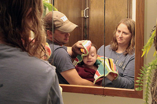
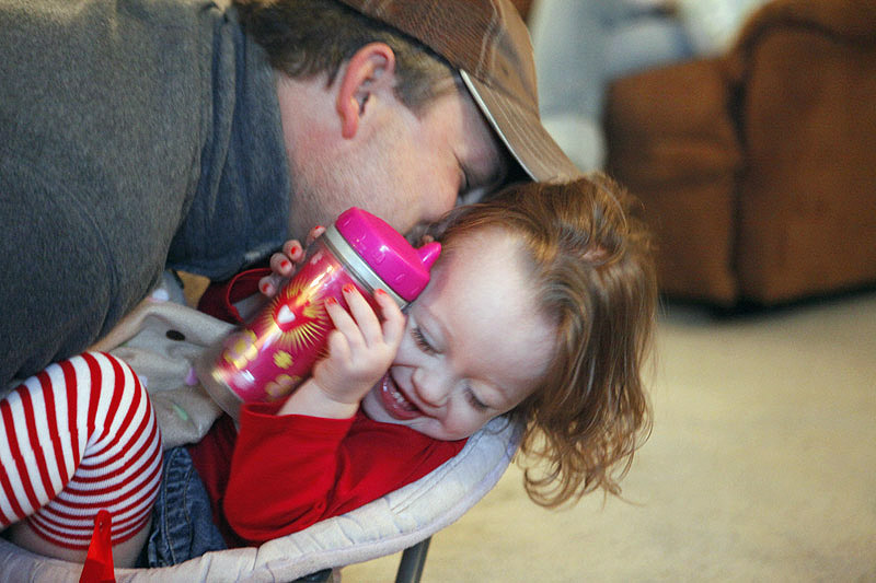
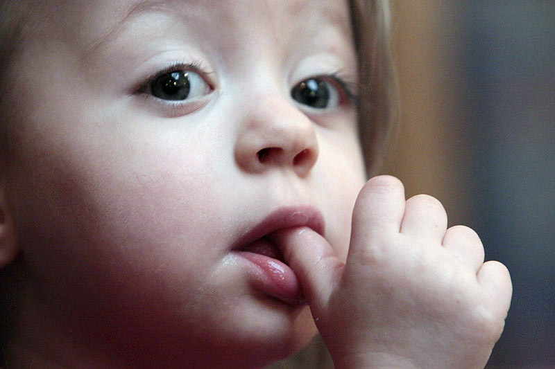
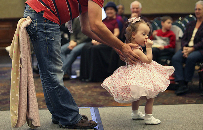
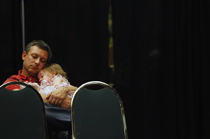
I chose this edit mainly because of the chronological order. I believe my opening image is a good example of a lede, showing the story of parents who pamper and care for their toddler. I then wanted to focus on the relationship between the daughter and her father since that's what I deemed the story to be about after looking at all the photographer's photos. My third photo is a detail shot that way there could be a bit of visual variety. The fourth photo showed powerful emotion and the fifth photo was included because I needed a portrait of the main subject. I believe this photo was a good portrait to choose because she always seemed to have her thumb in her mouth so I thought it was a fair representation of her character. The last two photos are my favorites so I figured I'd end on a strong note. The compositions and moments that were captured in these photographs perfectly summed up the story.
Here are our layouts:
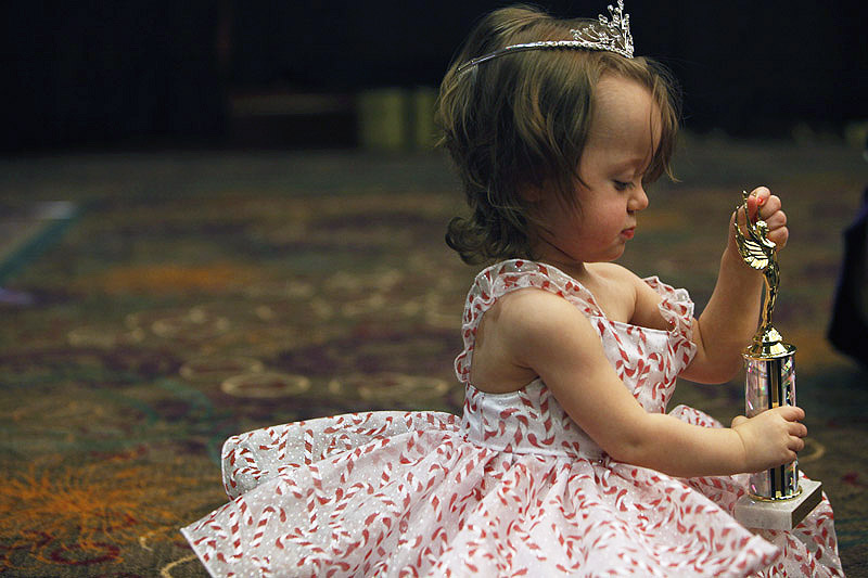
We chose this first image because we believed it was the perfect mid-range composed shot to sum up what the photo page inside would be about. It is a clean image and not only says that she's a toddler, but a pageant princess, hence the cheesy headline. We chose to make the headline a color we picked off of her dress to draw the reader's eyes to our centerpiece spread. We also wanted to include a tight shot of her face on the front instead of on the page because we had other photos we prioritized to fit inside. There are only three columns and they are centered differently as another tactic to display the centerpiece more prominently.
Since we didn't focus on the front page about the father-daughter relationship as much as I did in my 8 photo edit, we decided to emphasize that on the inside photo page. Showing that she isn't just in beauty pageants, but uses this as a way to bond with her dad. The large photo was the cutest moment that summed up their relationship, so we wanted that to be the lede image on the page. We also thought it paired nicely in style and composition as that on the first page. That way the reader would be able to tell easily that this is a continuation of the front page story based on style. The second largest image was next on the totem pole because it was a good scene setter and the only usable image of her on stage that the photographer had taken. The last two were included because the vertical was the best detail and the crying was the best emotion. They all came together to help paint a picture of what the story really was.
NOTE:
When the PDFs were converted to JPEGs in Photoshop they, for some reason, cropped in. So in the original files the white spaces around the edges were even and the pages were centered.

